Friday, November 7, 2008

PinHole Photography

1.src="https://blogger.googleusercontent.com/img/b/R29vZ2xl/AVvXsEiktfmWGe7lG234bSVIZ_OngVg9l00j0I7Fr8LxjovuvgJop9kzYyyrDfafeD5yWmpotre4l0AmpShrsJXU64IZ406VGugUlj89XG9X7xQwzVIqS21p3I_8mr8pjIaJ1Mv88Yg9amCZshA/s320/img010.jpg" border="0" alt=""id="BLOGGER_PHOTO_ID_5265946425247096450" />
2.


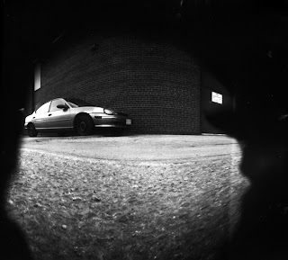
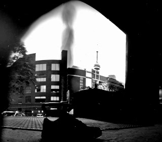
These three picture above are (in my opinion) my best three pinhole pictures that I have taken. On October 21st, my CyberArts classmates and I went on a field trip downtown to experience what is called Pinhole Photography. We were able to learn about pinhole photography and then make our own cameras, take some pictures and develop them ourselves. We worked and studied in a large gallery downtown, there were many rooms inside but we were in Gallery 44. We were asked to bring in a tin can of any kind as long as it includes a lid. How to make one? I'll explain, First we take our tin cans and to start off we made a mark so our hole wouldn't be too big. With a small drill nail we drilled in the small hole, then after we drilled in the bigger hole. It wasn't that big. Second we took aluminum foil cut out a circle and placed it over the hole. Before we placed it over the big hole we took a thumbtack and made an even SMALLER hole and then covered it. With black electrical tape we taped it around the aluminum foil. For that tiny hole we placed another piece of electrical tape over it so no light wouldn't enter into our tin cans. For the lid it really depends on what kind of lid you had. For plastic lids, you would take a large piece of aluminum foil and covered the whole top and then placed the lid over it. For me I had a large tin lid so all I needed to do was wrap the rim with the lid on with some electrical tape, but before we put the placed the lid on we were to cut the photography paper to fit the size of our cans and place the shiny side facing the hole. Then we placed the lid on.
How it works? Select a place on the ground and put your can down. Remember that tape we had over our little hole? Remove that piece of tape carefully, and let it stand for about a minute to a minute and a half. During the duration the light outside is being transfered into your paper which you have inside the dark tine can. It's really cool!
Once the time has finished place the tape over your hole again and you are ready to develop your picture!


Our instructor for the day was William Mokrynski, working with him was simple. Getting to know how pinhole photography works was awsome but making one ourselves was even more awsome! The whole pinhole photography thing was knew to me so everything was extremely exciting. If anything here is our instructors website to check out his work and maybe some examples of pinhole photography!

Here is the link!
on this website you will find many intresting things on pinhole photography, and there will be many recent updates. There are also several different/beautiful pinhole pictures for you to look at! :)

Wednesday, October 29, 2008

Photo Composition


This tree I believe goes under the rule of thirds. The way the tree is placed in the picture looks like it is to be divided in the rule of thirds.

href="https://blogger.googleusercontent.com/img/b/R29vZ2xl/AVvXsEhHFJZ2YsCKkgQ5JrKFKirx7ZwPlUpYZWh4olBxRMbYuNz9RO00dyWCoJ5RBrn2KXH49nBiyp0jm77O88osyr4GKkzmBu-edbdz7-LlCcDHDwKqx8rdPGXuYDXyDd-AJhmTwyzViEwyaKg/s1600-h/newtree.jpg">

This tree probably, well in my opinion, belongs under rule of thirds. The branch on the right side, bending a bit inwards to the left, kinda make me feel that even though it looks unbalanced it is still sort of considered to be under the rule of thirds.


I think this picture goes under simplicity, even though the grass seems a tad rough, the lip gloss stands out because of the pink, it looks quite vibrant compared to the (dull) green grass.


href="https://blogger.googleusercontent.com/img/b/R29vZ2xl/AVvXsEgVQEawmD_Bntv1rNwjN-OnSpeI4z7OLlD8qx51DPmsm6F5wk3tKQ-4P5s_jUJlcyAozDqolHPT0cYm1Wl-foRl2nxIaL2sBAwLvC835LUGjo4uCDTYpn0jwoJDZ1m1H6Qemls_au5a3MI/s1600-h/newswing.jpg">


This one I think would go under texture. Looking at the seats you get a feeling of leather, or a very smooth and soft texture.
It looks quite subtle.


This picture I took of the school lockers, I know i should've taken it outside but i couldn't find anything that has to do with lines besides the bike racks which were distorted. Anyway, this locker follows the category of Lines. I took these lockers from an angle to enhance the depth of the lockers and showing the lines more appropriately.

Wednesday, October 15, 2008


https://blogger.googleusercontent.com/img/b/R29vZ2xl/AVvXsEigaBwurVayN4q2MroxU2_Dy5c69Mw6UNMGSqPJ-pfV2GoIeps11kHrbjbIYA5WRlQXkCl52uRl4F4cKSkoIQSOMn8_I2_CS6L2XDs0Cy4HHO24DRpyEZvFFtUnog-y4ygxrBTeuEGeaPA/s1600-h/place_gambetta_apr_05.gif
https://blogger.googleusercontent.com/img/b/R29vZ2xl/AVvXsEh07WN3uUsajRTY_v1h71A938kffcNqReRYq-LrAyP98qImeUVTo6ty7Ty9ieBZSnH_Kt-qyIZDjyruYlHicXQrnuuvRcfnc63j7PsiRU9XVkgHP07gjO0XAGbp1zyugjMS3pR4rju2GGg/s1600-h/img_assign.gif
There are three types of lines, horizontal, vertical and diagonal, each one has a different impact among your picture. Lines are a very powerful element in the photography world, it takes a lot of practice to get the precise pattern of lines. So when an image is based on the concept of lines it is focusing on the lines within the picture, eg vertical horizontal and diagonal.

Simplicity


Simplicity is what you want the viewer to see { focus on } in the image. Easy and simple. To make an image simple there must not be a cluttered background, because a busy background would draw the attention away from the image.https://blogger.googleusercontent.com/img/b/R29vZ2xl/AVvXsEiX71-oEVXyus9xi3hpsgUHq8wT1PBvzfJeiCZKW5Ww02s5mrjAMu77HZJPVgLFTgSsy5VoL304yjs7L6BBq2B7TjrgMqc4Tox6FjRABTUbtyDzKhfB2RRSZ8AWbddtOmwdPxK_7iDX5x8/s1600-h/SuperStock_1796R-6213.gifhttps://blogger.googleusercontent.com/img/b/R29vZ2xl/AVvXsEgbnIOT8_GQDE8eK10ms37R1kW3sQ1BStvKKg_2WRoc0wt5tjlBJEgsspxsNdTGicF_O40QKxKFOIMZPHH9TksTfrscfoCfSEMZxSdPvocZ3eYFq2ivjCHVkTRYbcTMAxajviRFl76LSek/s1600-h/1843138229_9aaeeb6e00.gifhttps://blogger.googleusercontent.com/img/b/R29vZ2xl/AVvXsEgbnIOT8_GQDE8eK10ms37R1kW3sQ1BStvKKg_2WRoc0wt5tjlBJEgsspxsNdTGicF_O40QKxKFOIMZPHH9TksTfrscfoCfSEMZxSdPvocZ3eYFq2ivjCHVkTRYbcTMAxajviRFl76LSek/s1600-h/1843138229_9aaeeb6e00.gif

Thursday, October 9, 2008

My Company (:

I chose the Lady Bug because it looks sweet and innocent but when you get on its bad side, it will bite ya! I feel that I have things in common with this insect. Also I chose the colours blue and purple to represent my company because well, for one, they are my favourite colours, and two they look beautifully combined! They look like they also represent harmony, peace, soothing feelings. The main idea for my company, is to make any posters for special events, and we customize any requested card invitations.

You can see movement within this logo, in the wave lines around it. It draws your eyes around the circle, drawing a bit of attention towards the lady bug and the font the wave effect with the lines also give you a flow feeling and soft ribbons. Also the movement within this logo is, as I said quite soothing, I am pretty sure there are no major harsh lines, just nice smooth ones. I think my combined is quite good, not to be conceited. I feel that my colours combine really well, as well with the text and my animal, there is just something about it that makes me feel quite happy.


I must admit there is not a lot of rhythm in my logo, there is probably none at all if there it then I can not point it out. It is probably the text or the lines, or the dots on my lady bug bouncing from one dot to another.


The lady bug on the right side of the page seems pretty heavy, I balanced it out with the text on the left side of the page, my logo is quite simple.

Monday, October 6, 2008

My Chess Piece


For this blog, in class we were to sketch our chess piece that was given to us, take a picture of it and post it here. This is mine, cropped and contrasted on photoshop nothing else was edited. The lines in this picture is a tad bit fuzzy, and they seem to look as they have disappeared into the drawing, no harsh lines were created. The movement is quite soothing, it feels like there are red ribbons just floating around it and just picturing soft pink flowers around it floating around. A lot of colour coordination in mind.


The emotional effects i get from just looking at this picture is a soft, sad, small. The small chess piece with the big background makes it look, obviously very small. It is not colourful but if I were to imagine it with colour, I can not. It would not be the same, it looks better in black, white and grey, a lot more emotions are produced with no colour to me.

Thursday, September 25, 2008

092408-

"every step you take, is a decision you make"